
The project unfolded as a highly collaborative endeavour, with direct involvement from System Loco’s design team.
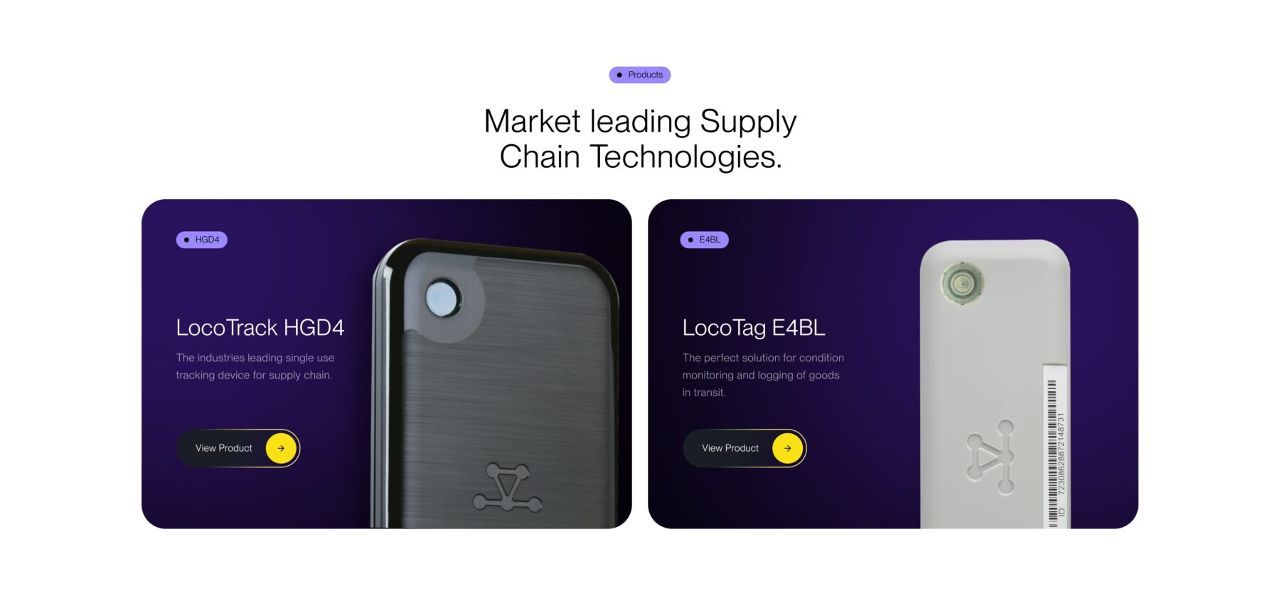
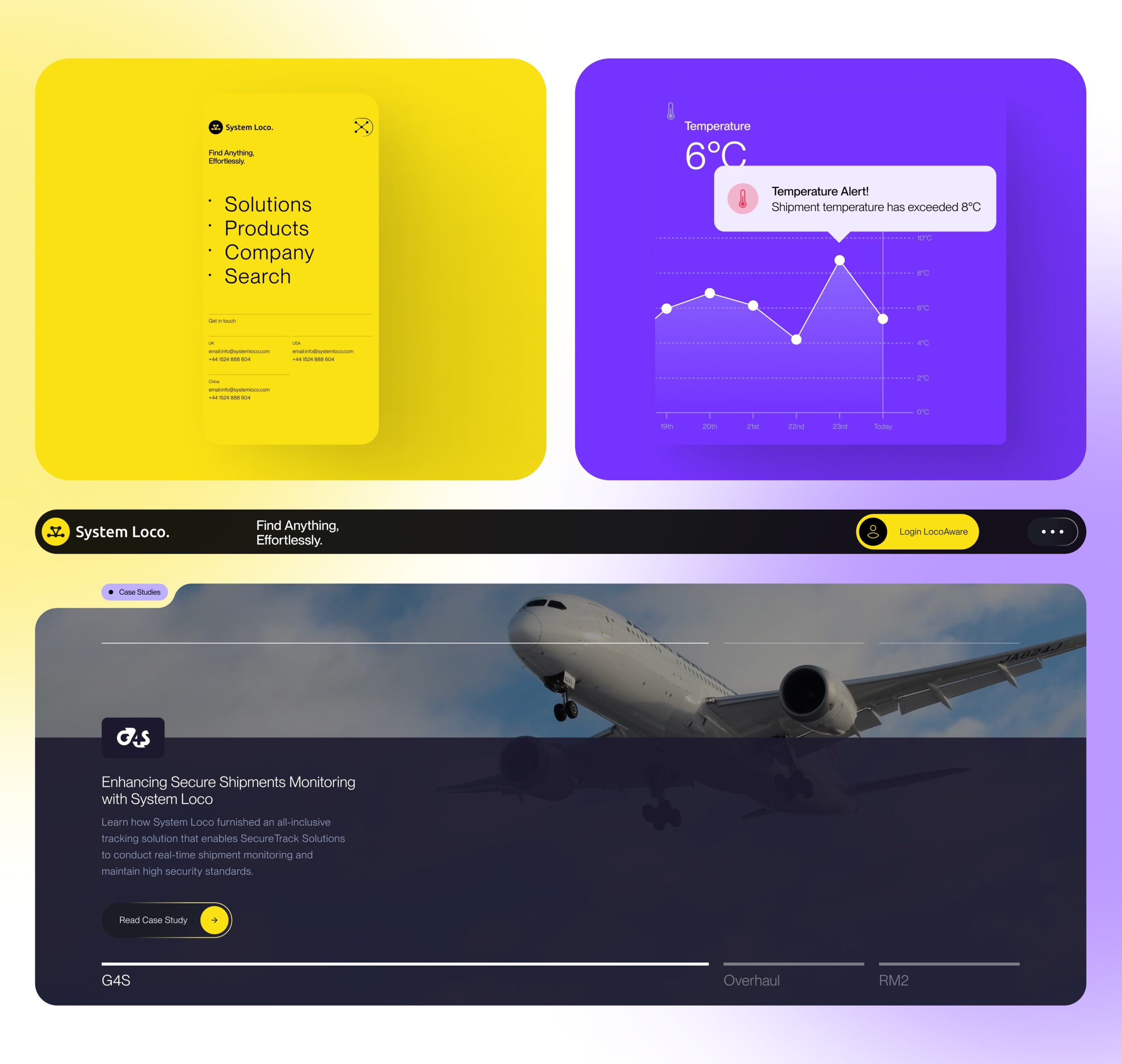
Special attention was given to conveying the features and benefits of System Loco’s products, which are integrated into the website’s design through the use of iconography. The incorporation of pulsing gradients serves to signify live tracking beacons, enhancing the user experience by visually communicating the real-time monitoring capabilities of System Loco’s solutions.
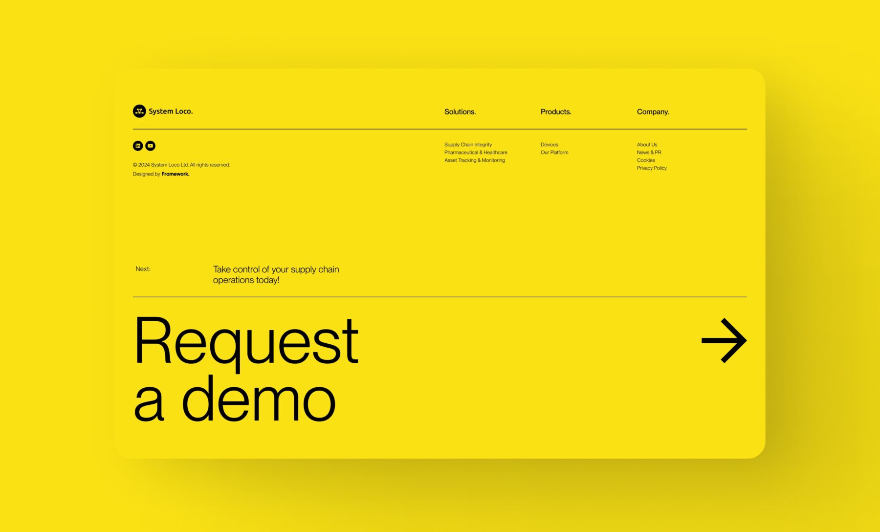
The design approach embraces a clean aesthetic, characterized by rounded containers and high-contrast colors, which not only enhance visual appeal but also ensure ease of navigation for users. The strategic use of yellow throughout the website creates a cohesive visual language, drawing attention to crucial elements and calls-to-action (CTAs).
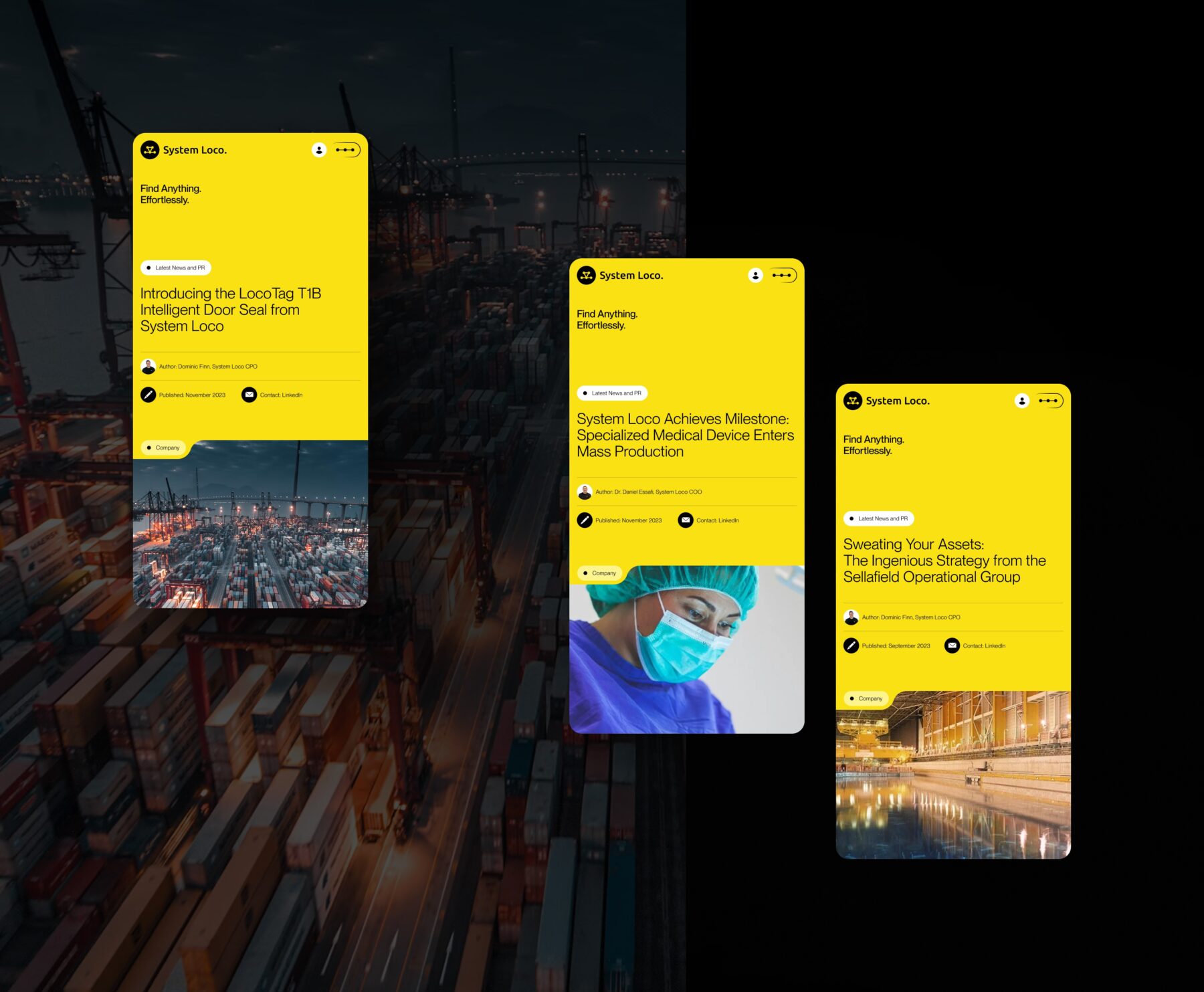

The project elicited an overwhelmingly positive response from System Loco which included enthusiastic feedback in the form of Taylor Swift memes. The finished product successfully met the brief by effectively showcasing System Loco’s capabilities and generating increased interest and enquiries for their products.

The imminent Phase 2 rollout further attests to the project’s success and ongoing momentum. As we prepare to unveil additional enhancements, the collaborative effort between the teams sets a precedent for future endeavors, reaffirming Framework’s commitment to delivering innovative digital solutions that exceed client expectations.
